


|
|

|
|

February 27, 2005
ARTICLE: Drawn to the story
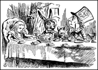 LEWIS Carroll’s Alice struck a neat blow for illustration when she remarked: “And what is the use of a book without pictures or conversation?” Certainly, Carroll’s story has been permanently linked in the common consciousness with John Tenniel’s unforgettably dreamlike and sometimes unsettling illustrations. Images like these in the books we grew up with lodge as firmly in our memories as the stories themselves. The illustrator fills out the characters with details not always described in the text. It was the Strand Magazine illustrator Sidney Paget, creator of the definitive image of Conan Doyle’s Sherlock Holmes, who, I am told by those who are steeped in these stories, gave the great detective his deerstalker hat.
Illustrating another author’s text (as opposed to doing your own picture book) is very close to acting, or rather being a whole company of actors, stage director and costume designer rolled into one. You do not always meet the author. Sometimes, if you do, it can be a disadvantage because the person you encounter socially may turn out to be disconcertingly unlike the possessor of the imagination at work in the text. The job involves trying to get a feeling for the story, the essence of themselves which all authors leave in what they write and which shapes the characters they invent. The aim, though you may not always achieve it, is to give your author, publisher and reader not what they want exactly, but what they never dreamed they could have.
If you were growing up in the 1960s and 70s, part of the last generation not to have been bombarded by moving, electronic imagery, pictures in books perhaps lodged themselves in your mind more vividly than they would do now. If you were just getting to grips with historical fiction then your experience would have been enhanced by Charles Keeping’s illustrations of craggy Vikings, or Victor Ambruss’s grave-faced warriors galloping across the page in a sweep of impeccable penwork.
It is possible that R.L. Stevenson’s Long John Silver was chillingly stamped on your memory by Mervyn Peake, whose illustrations for Treasure Island stand out among many other interpretations by so successfully catching the menace of that most charming of villains, an affability which could suddenly turn to murderous rage. All this went down well alongside Frank Hampson’s thrilling Dan Dare comic strip in the Eagle, which was in colour, and Ronald Searle’s incomparable line drawings for Geoffrey Willans’s Molesworth.
In my own 1930s childhood (I was a late and cautious reader) I was tempted into tackling a “proper” book by Thomas Henry’s sprightly illustrations for Richmal Crompton’s Just William. Henry depicted William throughout the 30s and 40s in unchanging attire: a suit with waistcoat and short trousers, a school cap and wrinkled knee socks which looked as though they had been carved in concrete. I found these drawings enormously attractive.
But long before this I had pored over those classic gift books with illustrations by Arthur Rackham, Edmund Dulac and William Heath Robinson. Rackham’s highly finished, muted colour plates and his line drawings of elves, fairies and gnarled tree roots were fascinating and impressive, though faintly disturbing. I loved Heath Robinson’s illustrations, especially his lyrical black and white drawings for A Midsummer Night’s Dream and the pictures in his own quirky book, Bill the Minder.
The attraction of A.A. Milne’s “Winnie the Pooh” stories for me was largely in the way Ernest Shepard’s brilliantly relaxed line drawings were dropped into the text. When, years later in the 60s, I attempted this myself in a book I had been commissioned to illustrate, I was told by the production manager that it would be too expensive to reset the text, this being in the days of hot metal typesetting. I was to stick to half or full-page illustrations only. Nowadays I sit beside a designer and watch with delight as she snakes my text in and out of my drawings on her laptop and changes the whole layout of a page before you can say “mouse”.
There was a lot of illustration work to be had when I first started doing the rounds of publishers with my folio in the 50s — magazine stories, fiction for older children and adults, classics, poetry and adventure yarns, not to mention comics. Most of it was in black and white. Some of the children’s stories I was commissioned to illustrate were fairly run-of-the-mill and much of the work I did I cannot contemplate now without extreme embarrassment, but it was a wonderful apprenticeship. It was a long time before I seriously got to grips with colour and even longer before I could use it with anything like confidence. I got this by splashing about with gouache water colour and chalks in my sketchbooks.
At that time there was a great pantheon of illustrators from whom one gathered inspiration: Edward Ardizzone, Anthony Gross, Lynton Lamb, Leonard Rosoman, Ronald Searle, Edward Bawden, among many others. They were not confined to children’s books, though they took them very seriously. They designed posters and advertisements, encompassed a whole range of graphic work in strongly recognizable styles. They shone out of the pages of the Radio Times which, for a few pence weekly, went into millions of homes.
Ardizzone is probably the most influential of these and is regarded with the greatest affection. His humorous, avuncular style was enormously adaptable. He was a distinguished war artist in the Second World War. He was also one of the first winners of the Kate Greenaway Medal, and wrote his own “Little Tim” books which he illustrated in pen and wash. He was largely self-taught (he copied Daumier, whose influence can be clearly seen). Just as some musicians are endowed with perfect pitch, he had a perfect sense of tone and with a few lines dashed on with his dip-and-scratch pen could tell you exactly the distance from foreground to background he wanted you to see.
It was Ardizzone who first gave me the idea that a picture book is like a theatre (except that it has a division at centre stage where the sewing is). You open it and up goes the curtain. But this is a very intimate theatre, which the audience can return to again and again. The characters you draw are like actors on a stage carrying the narrative along with gestures and facial expressions.
In my recent book Ella’s Big Chance, which is a retelling of the Cinderella story, I designed each opening like a theatre set, which afforded me plenty of space for some big, full-colour spreads, and put the text into tall panels on each side. To my joy, I found these would spaciously accommodate not only the type, but a lot of small black and white line drawings which are a counterpoint to the main illustration and carry the story along. Only after I had finished working it out did I realize how strongly those illustrated classics I loved as a child, with the tipped-in colour plates offset by line drawings, had stuck in my memory.
Clothes and disguises of all kinds are very important in fairy tales. I set my Cinderella story in the jazz age on the French Riviera with the dresses inspired by the great Paris couturiers of that era. The ballroom and dance sequences are inspired by the RKO Fred Astaire/Ginger Rogers films with those curving Art Deco staircases and wide, reflective dance floors that in my childhood represented the essence of glamour.
Today young children are nurtured on a huge choice of large-format picture books bursting with colours as bright as the TV and video imagery with which they are surrounded. There are television tie-ins, pop-up books and board books. All form an important part of what is now a major children’s book industry. Conversely, the number of illustrated books for older children and adults seems mysteriously to have dwindled in recent years. Publishers argue, very reasonably, that it makes books more expensive. Readers of fantasy fiction have their imagery packaged for them in the all-powerful special effects of the big screen. But there are signs now that the illustrated novel, which aims to elicit a more leisurely, intimate response, is due for a comeback.
The graphic-strip cartoon novel has, of course, survived triumphantly, especially on the Continent and in the US. Its narrative invention and multi-track storytelling are very difficult to manage in conventional prose. Although it is often delivered to the reader as a deliciously light souffle, it requires a prodigious stamina in the artist, with so many individual boxes to compose on each page. Art Spiegelman’s Maus is a towering example of this form, as is the almost unbearably bleak Jimmy Corrigan: The Smartest Kid on Earth by Chris Ware.
Posy Simmonds’s elegant, ironic humour is underpinned by a razor-sharp observation of characters we feel we all know, and in Gemma Bovery she more than proves her power to sustain a longer narrative. Raymond Briggs probably appeals to the widest age range of any illustrator working today. His strip cartoon autobiography of himself and his parents, Ethel and Ernest, is intensely moving, with a comic poignancy and artistry, which makes us long for him to give us another adult book.
Nicholas Garland has recently contributed powerful full-page woodcut illustrations to his son Alex’s novel, The Coma, in a style reminiscent of Felix Vallotton, a member of the Paris-based Nabis group of Post-Impressionist artists and illustrators. Garland has dispensed altogether with one of the strongest cards in an illustrator’s hand, facial expressions, and instead relies on silhouettes, brooding atmospheric interiors and objects charged with meaning. The effect is very filmic — a clever way to attract a young reader. Master wood engraver John Lawrence has given the small-format pages of Philip Pullman’s magical story Lyra’s Oxford a spacious, airy feel, while leaving us to make our own visual picture of the characters themselves.
There is a rich tradition of English illustration. The skill is acquired at the outset by applying yourself assiduously to life drawing, lurking about a lot with a sketchbook and then letting your imagination run riot. If you are attempting to engage an audience with a story, good draughtsmanship has to underpin even the most uninhibited colour technique; it is the muscular framework that holds you up as you trip a light fantastic.
It is a sad thing for adults and children alike if, once we have learned to read, the pictures in our books are sternly removed. They not only add to the pleasure of turning a page, they are the connection through which readers acquire the amazing human attribute of being able to get pictures in the head. And these, of course, are the best illustrations we will ever see. — Dawn/Guardian News Service
|
|
|